
Before you can talk to a game, you first have to tell EchoControl which game that is. One screen: pick the game, load its profile. Sounds like half an afternoon of design work.
It took us eight days and six different versions. The one we ended up shipping is the plainest of them all.
Where we started
The first version was a grid of cards, one per game, each with a small round image. It looked clean, but flat next to the rest of the app: the main menu already uses gradients, embossed icons, some motion. Next to that, the selection screen looked like an unfinished sketch.
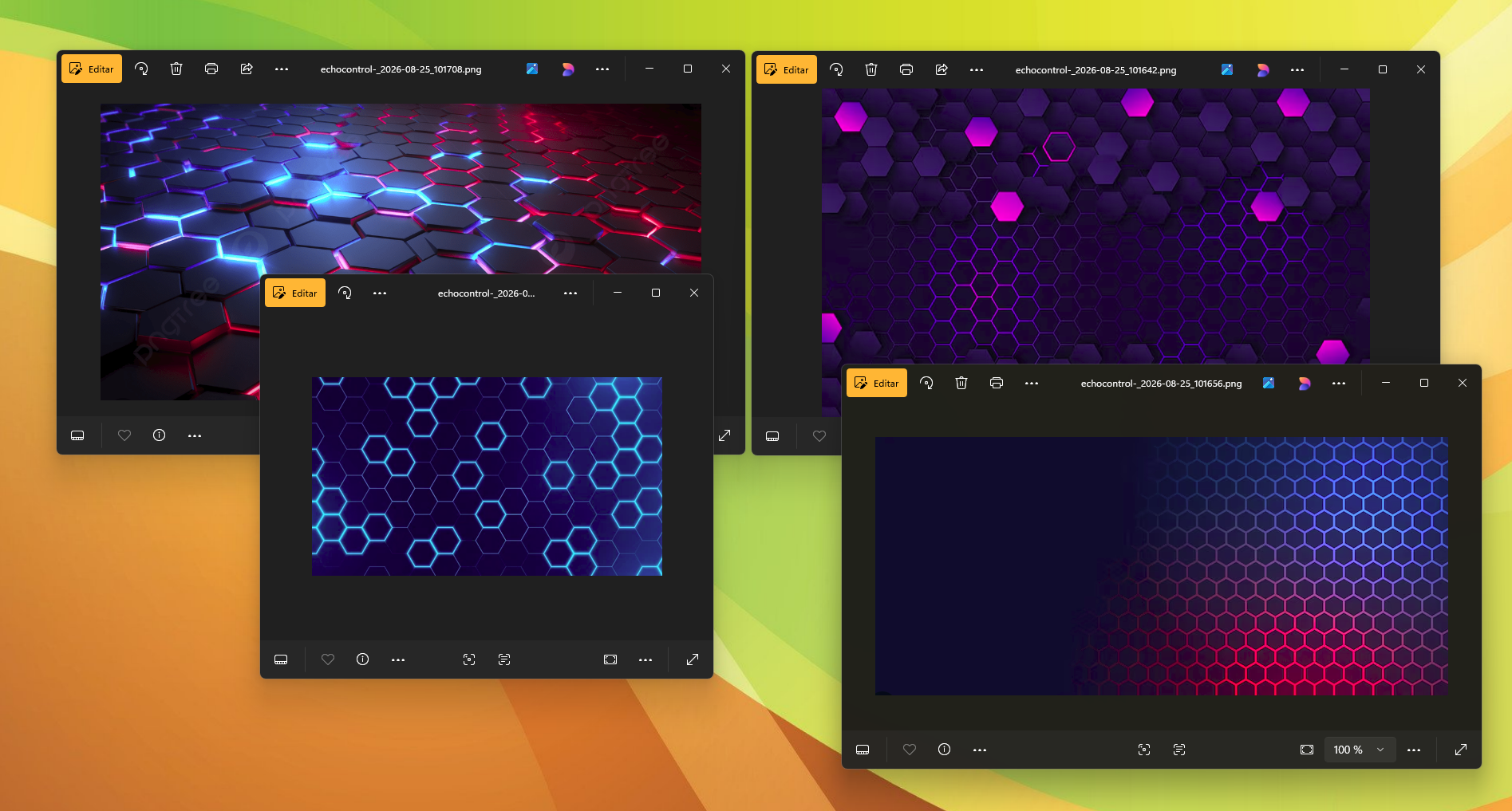
So the next version added a hexagon shape with a textured background, with an orange tint on top. It looked better — for about a minute. The moment we showed it to someone outside the team, the first question was "what is this supposed to be?" It wasn't supposed to be anything. It was texture filling space.
What we tried, in order
- Hexagon background. Looked good in a screenshot. Felt busy as soon as we put the real game icons on top: too many shapes competing for attention at once.
- Six textured backgrounds, plus a slider. Not one — six, plus a live control to adjust how strong the texture looked. We built a whole extra tool just to test other tools, and at some point realized we were fine-tuning the problem, not solving it.
- New textures again, much softer this time, plus a fix for a bug from the previous version — the icons of two games overlapped by a few pixels at low resolutions, something nobody had noticed until this round.
- A "final" textured version — four backgrounds picked at random, one fixed strength, no slider anymore. We called it "final" in the team chat, in quotes, half joking. It lasted three days.
- We removed the textures completely. The icon grid became a scrollable list, grouped by game genre, each group with its own small icon instead of a big background. It was the first version where, testing it, nobody had anything to say about the background — because there was no longer one to talk about.
- Final polish — outlined buttons, our logo, a plain "Select Game" label. No background art anywhere.
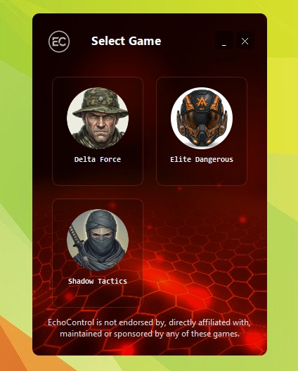
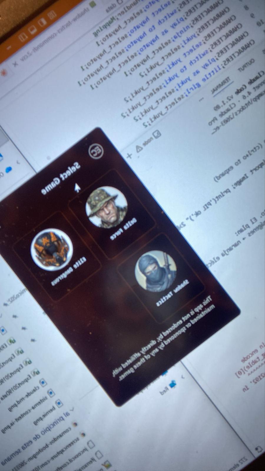
That hexagon-and-icons version wasn't just a mockup — it actually ran, and we tested it on a real monitor before deciding it had to go.
Why the plain version won
None of the textured versions were bad. They were just solving a problem this screen doesn't have.
Inside a game, a custom background makes sense — you're already looking at it while you play. The selection screen is different. You see it for two seconds, and it has one job: help you find your game fast.
A busy background slowed down exactly that. The genre list does the opposite. You already roughly know what kind of game you want, so grouping by genre helps you find it without needing any art at all.
It's easy to confuse "pretty" with "right" once you've been staring at the same screen for a week. All six textured versions were, each in its own way, prettier than the one we shipped. None of them was a better selection screen. It took us eight days to tell those two things apart.
We kept custom art where it actually helps, and removed it where it didn't. The selector now uses the same plain gray as the rest of the settings — no per-game background, no sliders, no image picker. It's the simplest screen in the whole app, and it took the most redesigns to get there.
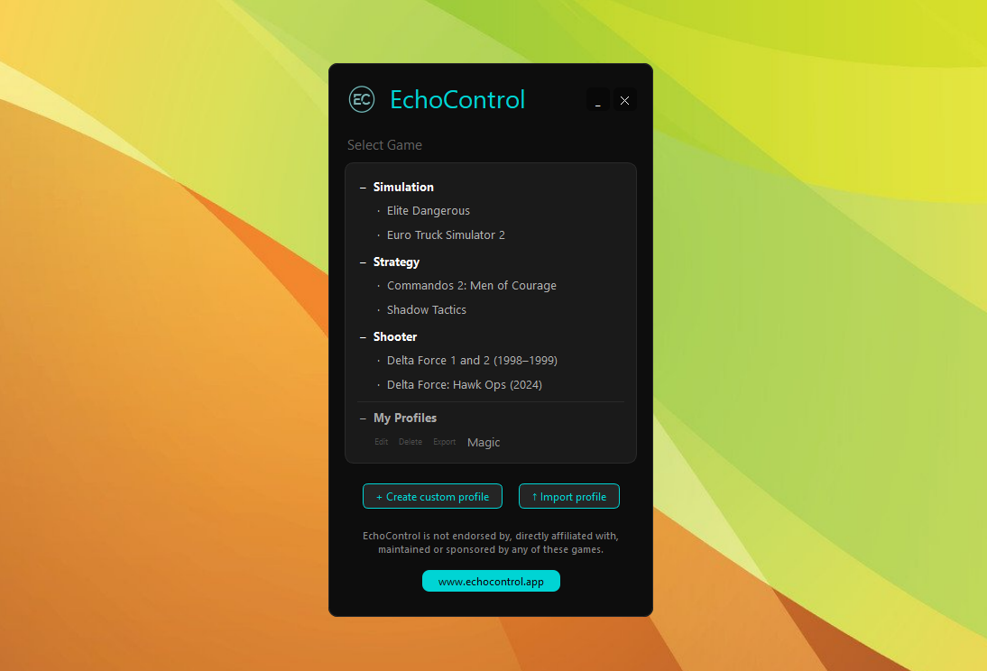
Eight days to reach the most boring screen in the whole app. And it was the best-spent time of the entire redesign.
See the selection screen — and everything else — in action.